The Scrollable Panel is a tiled layout container used to display multiple content items in a scrollable format side by side with fixed position elements. Scrollable panels can be used to display visuals, slicers, dynamic images, text, web panels, mini-tabs, buttons, and images.
Note: This feature is not available in the Community Edition.
Adding Scrollable Panels
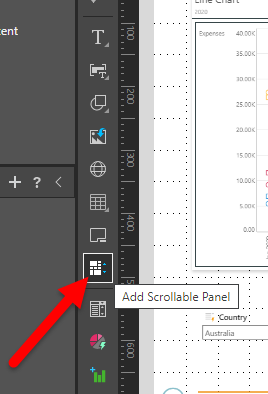
To add a scrollable panel to the slide, click Add Scrollable Panel from Toolbox (red arrow below). Then click anywhere on the slide to place the panel, where it can then be moved and re-sized.
Add Assets to the Scrollable Panel
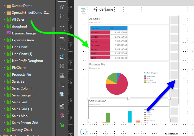
Drag the required visuals or other assets onto the panel directly from the Content panel, from the App Tabs (where your visuals are open in Discover), or from elsewhere on the slide.
As you add assets, they will automatically be "trellised" in the panel, and a vertical scroll bar will be enabled (blue arrow below) once there are more assets than you can see in the available space.
Assets added to the scrollable panel can be re-sized as needed. The tile layout (used in all scrollable panels) automatically applies a "snap to grid" behavior, making it easy to align your assets and ensure they conform to a standard size.
Slicers
Slicers can be added inside the panel or outside the panel. Regardless of the slicer's location, interactions will automatically be added from the slicer to the assets in the scrollable panel.
Mini-Tabs
You can drag Mini-Tab containers into the Scrollable panel from the canvas. The content and actions / interactions associated with the Mini-Tab container are the same regardless of whether it is inside or outside of the scrollable panel.
Scrollable Panel Formatting
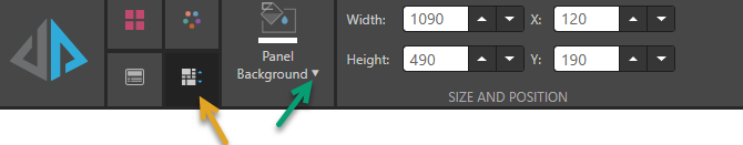
With the scrollable panel selected on the canvas, click the Component tab (orange arrow below) to access its formatting options:
Panel Background
To change the background color for your scrollable panel, open the Color Picker from the Panel Background dropdown list (green arrow above). The background color for the panel changes to your selected color:
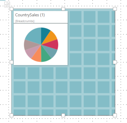
Note: This example shows a scrollable panel in the Present Pro view. When your presentation is viewed at runtime, the scrollable panel will have a solid color; that is, it will not show the "tile layout" guidelines that you see in the editor.
Size and Position
Change the size and position of the selected item:
- Adjust the item size using Width and Height.
- Adjust the item position using X and Y.
Tip: The X and Y coordinates and width and height are displayed underneath each content item when it is selected on the canvas.
Scrollable Panels at Runtime
When the presentation is launched at runtime, you can scroll up and down through the panel as needed. The assets behave as usual at runtime. Slicer and cross-visual interactions are enabled by default.